Ecocamps
Story
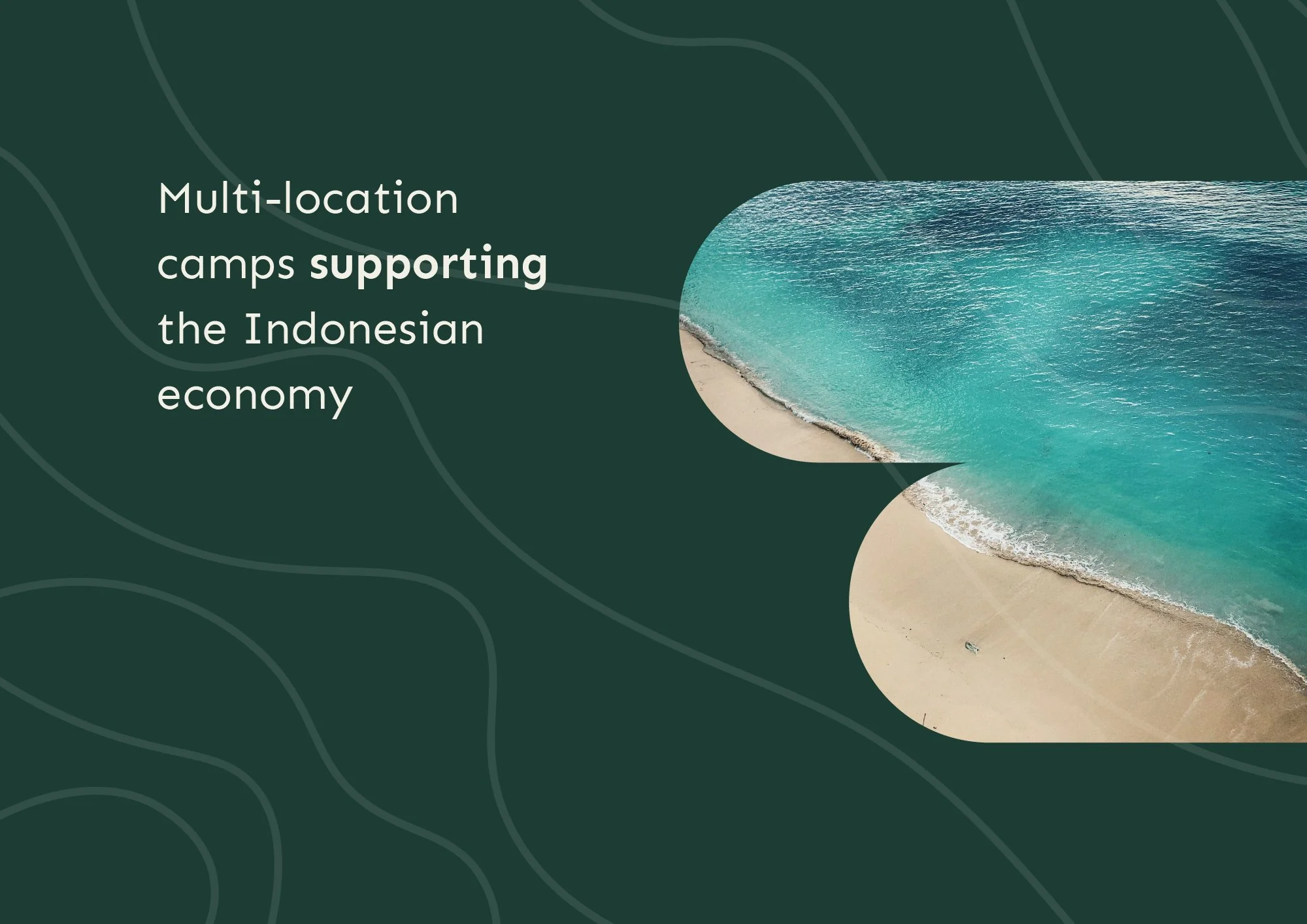
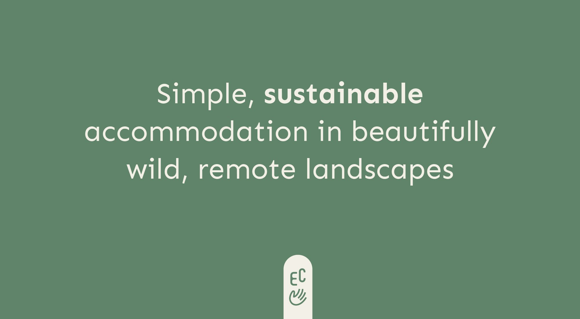
Ecocamps is a new initiative, tailored to the international traveller who craves fuss-free, low-impact accommodation in Indonesia. These beautifully simple and welcoming camps offer truly authentic experiences and are built with sustainable practices and low-impact materials.
The challenge with the Ecocamps identity was its positioning. As relatively basic accommodation, a ‘luxury’ aesthetic would be misleading. We wanted to communicate all of the great reasons for a traveller to stay at an Ecocamp, whilst honestly setting the expectation that things are somewhat functional—stylish, but simple.
Result
The Ecocamps concept is cool, thoughtful and fun. The logo lettering and colour selection reflects their ethos and values in an accessible and inclusive way—there’s no ego here, just a desire to do good in the local area, and a vision to share that with their customers.
The logo is supported by a little hand icon—both waving in greeting and indicating that this is a business built on supporting communities and ecology as well as travellers.