Ascendance
Story
Ascendance is a charitable organisation doing fantastic work across the Yorkshire region. It runs inclusive dance workshops, performances and classes to promote well-being and community support. It also runs a hugely successful Dancing with Parkinson's programme.
They approached me as they wanted a t-shirt design for a forthcoming performance. As well as this, I agreed to look at their logo and general branding at the same time—the application of their brand had been a little inconsistent up until now.
Result
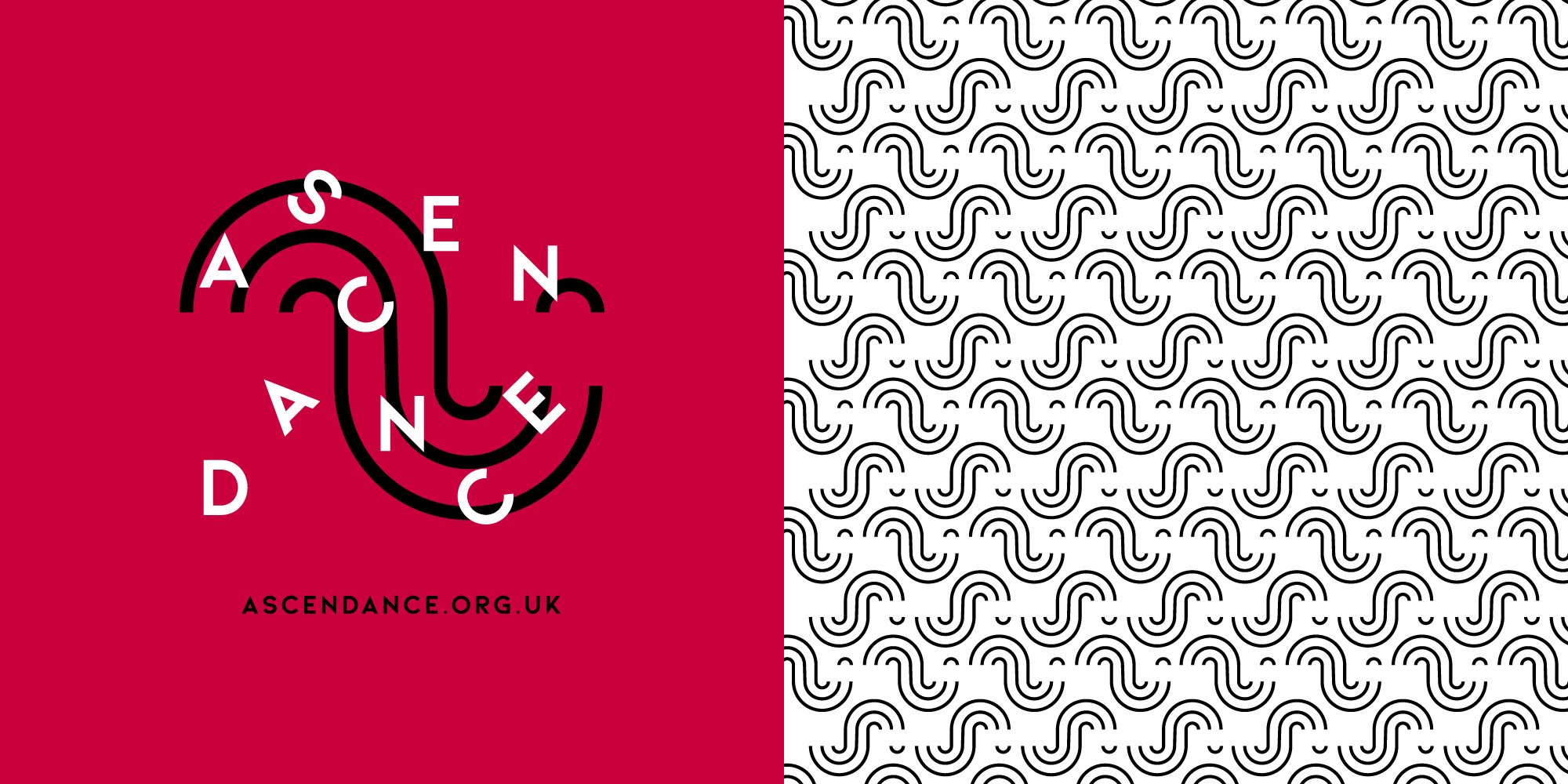
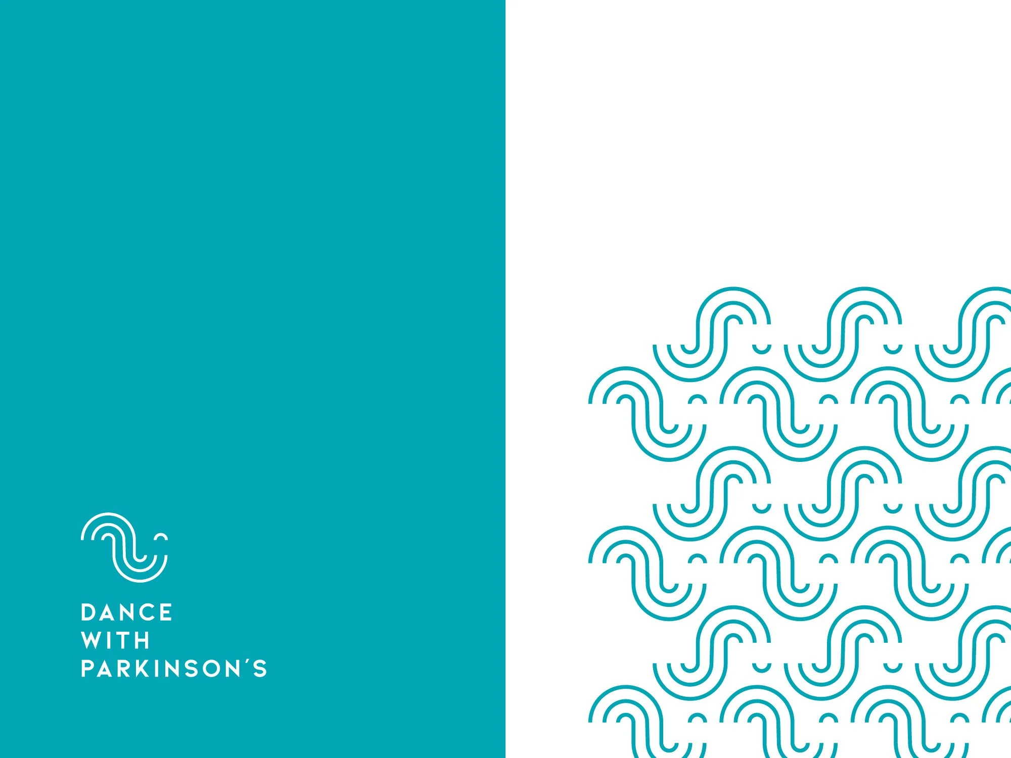
This bold, fun branding originated with the idea of a wave (a suggestion from an Ascendance dancer). I created an abstract pattern from conjoined lines and circles. It was also a nice touch that, from the pattern, a smiley face emerged. This is what formed the logo symbol 🙂
The two themes of a continuous, repeating wave and the smiley face just seem so fitting for Ascendance and the community work it does—lifting people’s hearts and minds through dance!
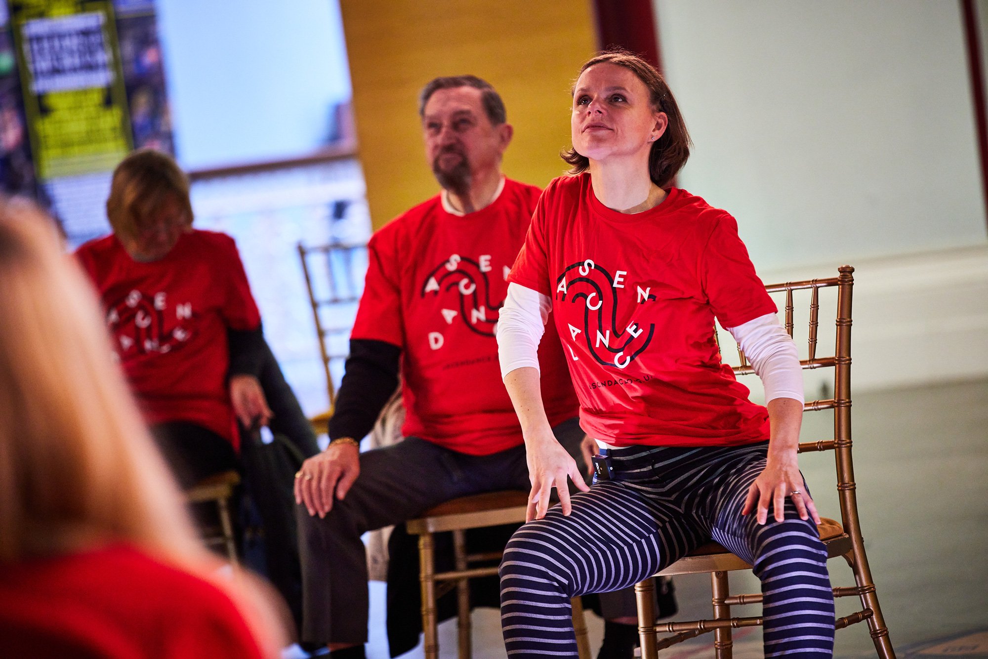
The concept has translated out really well into a large variety of logo variants and executions which would lend themselves to any branded marketing materials or campaigns. I also designed some fun, abstract versions of the logo—which look like they’re dancing! I applied one of these more abstract arrangements to the t-shirt.
Photos © David Lindsay & Ascendance

